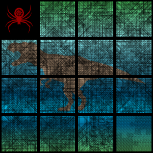
My fifty-year journey begins here – 1972. This is the year I graduated from the University of Arizona. I was now back in Charleston, SC where I did most of my growing up. One evening, while visiting one of my local watering holes, a fellow patron presented me with a small, square of paper and asked if I could read the message it contained.
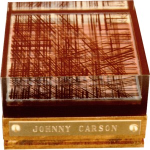
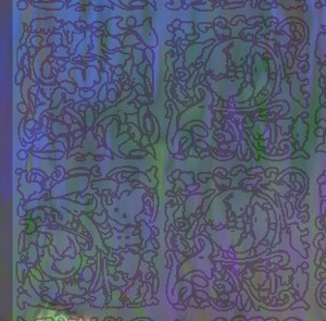
Here’s the scenario. If I could read the message, he would buy me a drink. If I could not read it, I would buy him a drink. It’s a bar challenge. They come in all forms. I took him up on it. Here’s an example of that paper square. This graphic is a representation. The original is long gone.
Well, I couldn’t discover the message, so I owed the fellow a drink. He then proceeded to explain how to read this spider web. The letters become readable when viewed on a horizontal plane. It took me a while, but I finally got it. Wow! Amazing. That little piece of paper started me on a journey that has lasted fifty+ years. Oh, there is the red spider.
(2022) My goal is to employ the bar challenge’s linear graphic style to reveal a traditional text-based substitution cipher while bringing the combination into the realm of conceptual art with an unmistakably distinctive style. All of my Trithemian Web™ compositions contain one or more linear graphic lettering sequences, either visible, partially hidden, or mostly hidden, making my ciphers uniquely identifiable.
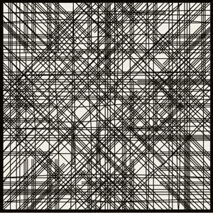
Would you like to become fully immersed in my linear graphic evolution? Print this pdf. It features an enlarged version of the bar challenge representation. How To View is included.
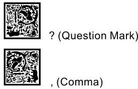
This representation does employ spaces between words, making it easier to understand. Trithemian Web™ ciphers do not have word spaces.
Note: This sample piece is not encrypted. For more on ciphers, I recommend reviewing the Instructions page.
That piece of paper had captured my imagination. I wanted to pass along the exhilaration I felt when I finally discovered the secrete to the challenge. I kept experimenting with alphabets and design variations.
This is the year I started working with liquid resins. Could I encapsulate these linear graphics in a cube? I used India ink in an architectural pen to draw the lines, first on a yellow layer and then on a clear layer. It worked. Man, I thought I really had something here. No one, to my knowledge, had done this before. Now, what could I do with it? Yes, I still have this original cube.
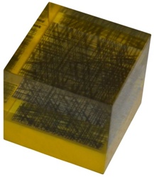
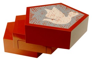
It is small – a little less than two inches square. This success got me thinking. Could I produce a larger version? And what if I could get my creation into a major art festival? My path wasn’t totally clear, but I designed and produced a large cube along with a miniature I planned to offer as a limited edition.
Photograph of the miniature used for brochures.
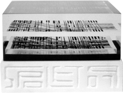
Photo taken on a horizontal plane so one can see how the linear graphics can be read. The cube is read in four separate directions. It has two levels – the top one being in English and the bottom layer in Italian.
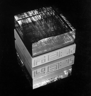
Display of the large cube and its miniature edition.
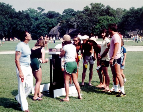
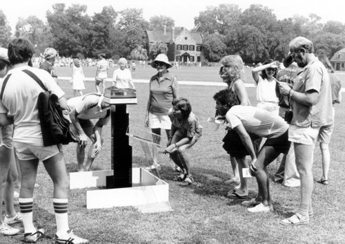
The finale of the 1979 Spoleto Festival was held outdoors at Middleton Place Plantation. Thousands of people would be attending, so I moved the Spoleto cube to take advantage of the final day. The cube is a kinetic piece – it moves the audience. You have to circle the cube in a clockwise direction to read all segments of the encapsulated verses. There were people circling the exhibit all day.
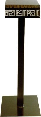
Although Spoleto 1979 didn’t lead to any riches or recognition I stll planned to introduce a new piece at Spoleto 1980. I called the piece Black Magic.
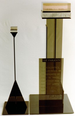
I did a lot of experimenting with resins. One of my trials was unusual to say the least. I took a quarter inch thick piece of black Lucite and drew a set of linear graphics using black India ink. Black on black.
I then proceeded to overlay the black Lucite with 3/4″ of clear resin. The result was surprising. When you looked at the cube from above it appeared to be solid black. When you looked through the cube it appeared crystal clear and the linear letters appeared silver. It’s a very interesting phenomenon. I called it Black Magic.
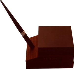
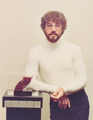
This pen set has a Black Magic cube positioned on a walnut pen holder. I was considering this desk set as a commercial venture. This proved to be unrealistic at the time due to the cost to commercially manufacture these cubes. That was in 1980. Maybe they could be produced at a reasonable cost today (2022).
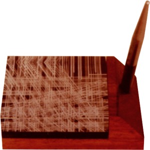
Desk set with a cube that uses white letters on a black Lucite base.
Wearable medallion experiment.
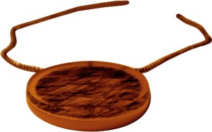
Experiment using a mirror with a clear cube using black letters.
This is the large Black Magic cube I showed in Spoleto 1980. No miniatures were offered because of limited demand in 1979. I can’t remember where I showed this piece.
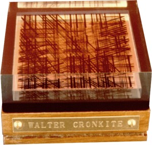
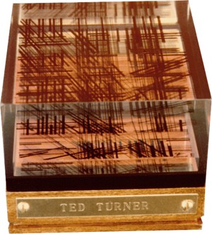
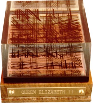
I never considered myself a marketing expert. Everything I did up to now was an attempt to commercialize a new idea. So far no luck. The following four pieces were sent to well known people in a promotional effort. Each piece had a verse specifically written for them.
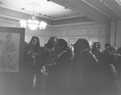
Kata Billups and Gian Carlo Menotti looking at Kata’s light box – a three sided piece. The intensity of an interior light changes the images. She developed the technique. I’ve never seen anything like it.
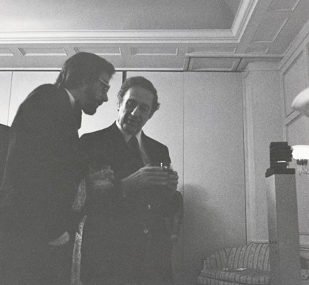
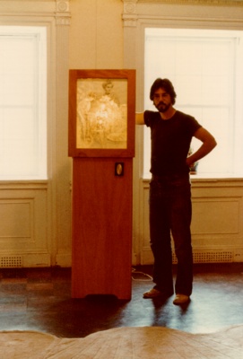
Gian Carlo Menotti and me beside my sculpture – One Life’s Spiral.
One Life’s Spiral and me.
Kata’s Light box.
 The Arena sculpture.

Art show in Ohio. Viewers circled the sculpture all day.
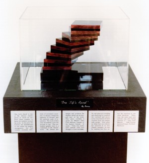
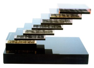
One Life’s Spiral sculpture.
The Ten Commandments. Lucite mounted on black granite. The letters were silk screened onto a black Lucite plate. This small piece has four separate quadrants that contain all ten commandments. This piece is all Lucite, not poured resin.
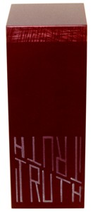
Truth sculpture.
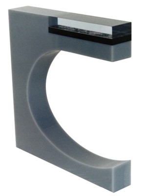
The Law sculpture.
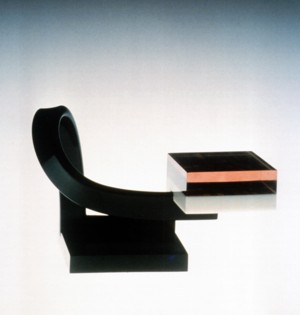
Retiring sculpture.
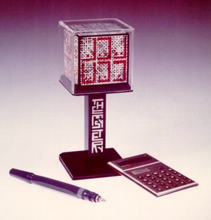
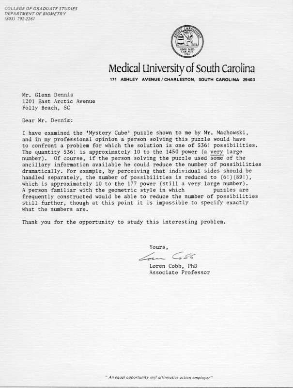
The Mystery Cube.
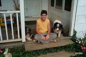
I looked over my autobiography trying to determine the year Kata and I traveled to New York. I settled on 1981, but it could have been anywhere from 1978 to 1982. I believe we drove up from Charleston in my Volkswagen Beetle. We went up to take in some art shows and visit friends in the city. In addition, we made a side trip to Greenwich, CT to visit the mother of one of Kata’s best friends – Hutsie. Pictured at left in 2001.
I must have shown my portfolio to Judy, or she saw my work when she visited Charleston. Neither Kata nor I could definitively remember. Anyway, Judy recommended that I GO BIG. I assumed she meant very large pieces, not lots of small ones. I’m sure she was commenting from an art perspective.
2020: I spoke with Kata in early 2020. She reminded me that Judy told me to GO BIG!
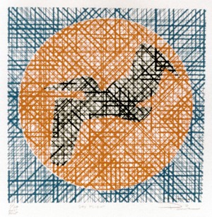
Day Flight – Silkscreen on paper. 16″ x 16″. This was my first attempt making a larger, printed piece that could be framed and displayed. It was small enough to be taken off the wall and viewed horizontally to read its message.
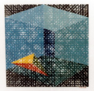
Within Without – Painting on Lucite. 24″ x 24″. This was my first and last painting. I framed this piece and added glass for protection. July 2021 update. I took it off the wall and tried to read it. Impossible. The glass was too reflective.
This is a three tiered coffee table I built. I included a linear graphic message on the top. The finish is an automotive enamel that still looks the same today (2021).
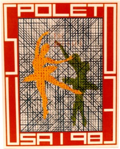
The Dancer – Silkscreen on paper. 24″ x 18″. I made this as a concept piece for Spoleto 1983. I don’t think I displayed it anywhere during the festival.
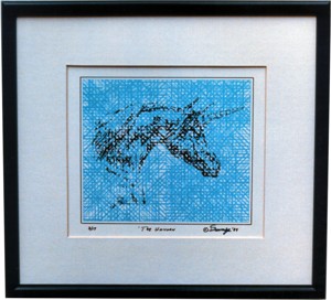
The Unicorn – Silkscreen on paper framed with a wide mat.
I spent a lot of time traveling back and forth to New York City where I would consult with artists, designers, packaging producers, marketing experts and the like. My cousin Susan, who lives in Bay Ridge, would set up appointments for me and off I went. This was all in an effort to come up with a viable commercial product.
This year I decided to invest in some market research. I hired a firm in Boston to do some mall interviews. I wanted to gather input from consumers regarding these linear graphic prints. That research was extremely positive. It was a small study, but the results were intriguing.
I should have followed up and produced a quantity of prints with the goal of getting them into local retail locations. But I didn’t do that. One possible explanation – I didn’t believe the research data. That may have been a huge mistake that set me back over thirty years. In the back of my mind was another nagging thought, probably the most dominant. I just didn’t see people taking these prints off the wall to read the message.
Furthermore, there’s a learning curve involved – how to read them. There were no cell phones or Internet in those days to disseminate information, so instructions would have to be included with each piece. Not a real big problem however.
As I think back on these issues today, I should have taken a lesson from the bar challenge. People were intrigued when told there was a message on the paper. That same feeling probably would have occurred when told there was a message in my print.
Do you remember the stereograms in the mid 90’s. When people were told there was a hidden image that required relaxed vision to see, they couldn’t believe it. People bought those prints hoping they would eventually see the image. A marketing success based on curiosity. My prints might have achieved the same success had I not had my doubts. I just didn’t commit.
This was a slow year. Too many things to do and not enough time to do them.
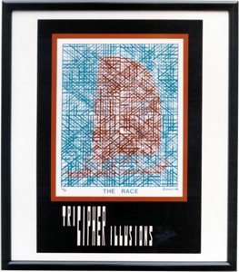
This print is called The Race. I began experimenting with different catch all names for my work. I now called my prints Tri Cipher Illusions. That sounded catchy. It also imparted a clue about the print.
Did I initiate a print run and try to market the thing? No! I was still stuck on the notion that people would not take the prints off the wall to read them. If they framed the print with glass the opportunity to read the message was gone. Double trouble.
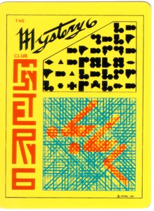
Another concept explored, the Mystery 6 Club. Its been a long time since I worked on these 3×5 plastic cards. I can’t remember all the particulars. I know it involved a deck of these cards, linear graphics, and some strange black symbols.
Packed away somewhere may be a folder explaining this concept. I don’t think I would have thrown the cards out.
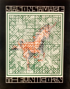
The Unicorn – Silkscreen on paper. 27″ x 25″. This is a quad panel print. It has to be rotated 16 times to read the entire message. I framed the print and used glass for protection. Today if I wanted to read the print I would have to disassemble it. I have it hanging on my bedroom wall (2022).
I knew there was an inherent problem with these prints, especially the larger ones. Even if they were not framed using glass, it was a hassle to take them down, put them on a horizontal surface, and then rotate them numerous times. That just wouldn’t be practical. However, I saw no solution.
Somewhere I read about a fellow who helped introduce Trivial Pursuit into the United States. I don’t remember a great deal about him. He might have worked for Selchow & Righter, the NY firm that purchased the rights to produce and market the game. I called this fellow, and he seemed very interested in what I was doing.
Today (2022) I would have done everything electronically. In 1986 I decided to fly to New York for a day to meet this man and get his input. I took this unicorn print with me. He liked my work and understood the concept. He made a parting comment, “You’ve got a problem.” As if I didn’t know that. He felt that removing a print from display to read the message was a killer as far as marketing was concerned. He could offer no solution. A done day in New York. Off to home I went. This issue would burden me for the next thirty-four years.
I couldn’t stop thinking about removing a print from display to read its message, so I stopped working with my linear graphics. It was hard to leave an idea I had been working on for years, but no one, including me, could come up with a solution.
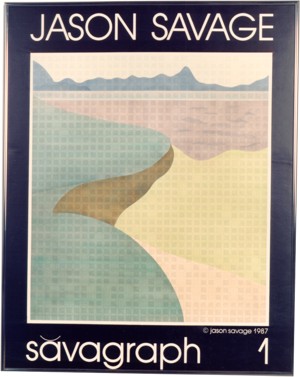
I changed the product’s name to Savagraph. Instead of linear graphics I switched to symbols. I designed symbols to represent letters, numbers, punctuation, and blank spaces. A symbol sheet would be included with a Savagraph.
An inquisitive viewer could use the symbol sheet to translate each graphic into its corresponding letter, number, or punctuation. These would be written down on a separate sheet, starting at the top left and proceeding from left to right, top to bottom. The print is viewed straight on. There is no need to remove it from display. Framing with glass is now OK. Problems solved. This approach may be the answer to a successful introduction and marketing campaign.
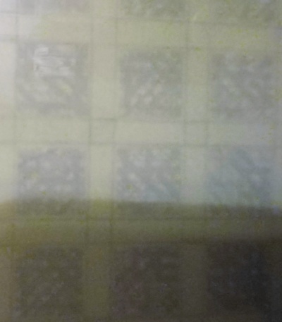
This is not a good photo, but it will give you some idea of what the symbols look like on Savagraph 1. This piece has one problem, the symbols are too small. That can be easily corrected. The addition of this design would give more fire power to my portfolio.
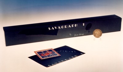
Packaging design for Savagraph 1. When the print’s owner deciphered the piece they then became eligible to receive a specially minted coin.
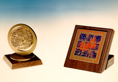
These are other reward options.
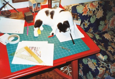
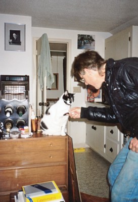
Zoe, the animal love of my life, is helping me with my design work. I was still doing everything the old fashion way.
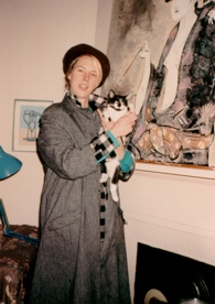
Kata Billups and Zoe in her Charleston apartment. There’s a great story about this full rumpy Manx cat. I got Zoe from Kata because she was getting married and couldn’t keep the kitty. Zoe in Greek means life in all its manifestations. Read all about Zoe in my autobiography, now on CD.
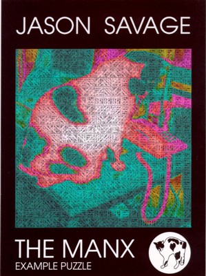
I’m experimenting with names again. I used a photo of Zoe on my work table for this piece. Like the 1987 Savagraph, I used individual symbols to represent letters, numbers, and punctuation. I did increase their size for easier identification. This was just another experiment and addition to my portfolio. I still can’t stop thinking about my linear graphics. No effort was made to commercialize The Manx puzzle.
Zoe congratulating me on my work. The sad fact is I haven’t done much with the art in the past two years. I think about my linear graphics almost every day. I still do experiments. How could I keep from taking the prints off the wall to read a message or decipher them. I couldn’t come up with an answer. I’ve mentioned this to friends and colleagues, but they had no solution. Its been nineteen years since I took the bar challenge. Time is relentless.
I kept doing my experiments with linear graphics and coded puzzles. By this time I was doing all my design work on the computer. That gave me much more latitude.
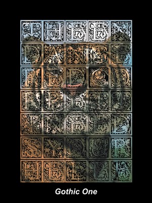
Gothic One was designed for Dr. Michael Bleyman, tiger expert and founder of the Carnivore Preservation Trust. I worked with him and his tigers until he passed away due to kidney cancer at the age of 58.
Gothic One is composed entirely of Gothic letters that I hand drew. My puzzle work had taken on an entirely different form. If you would like to see more of my recent puzzle work please visit The Tribute Master.
I have been very busy over these past six years. I spend quite a bit of time training for road races. See my Your Running Memories website. To learn a little more about what’s kept me busy see Meet the Designer.
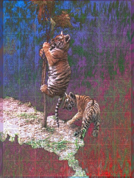
Working with Dr. Bleyman and his tigers was inspiring. A dream come true since I saw my first tiger interaction at the San Diego Zoo. I designed this puzzle featuring the photo of two cubs taken at the preserve.
This is a close up of the symbols used in the Cub Puzzle. They are much easier to identify.
The symbol set with corresponding letters, numbers, and punctuation.
Its been four more long years. I still try to come up with an answer to my dilemma. Either stop thinking about my linear graphics concept or come up with a solution. The bar challenge is what got me started on this very long and frustrating journey.
My trips to New York ended years ago. I couldn’t find the answer there. I have been concentrating on constantly improving my symbol substitution puzzles. They are now much more sophisticated. I could have produced enough work to put on a show, the traditional way to introduce an artist/designer. I probably should have considered that route decades ago, but I couldn’t let go of my passion to pursue my linear graphics concept. Although, if I had pursued marketing The Unicorn in 1984 things might have turned out differently.
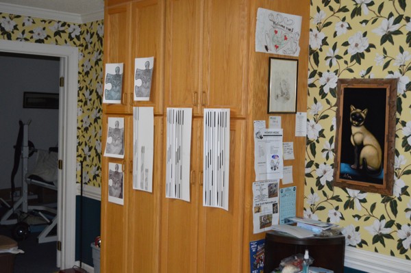
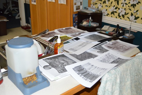
There are tests all over the house.
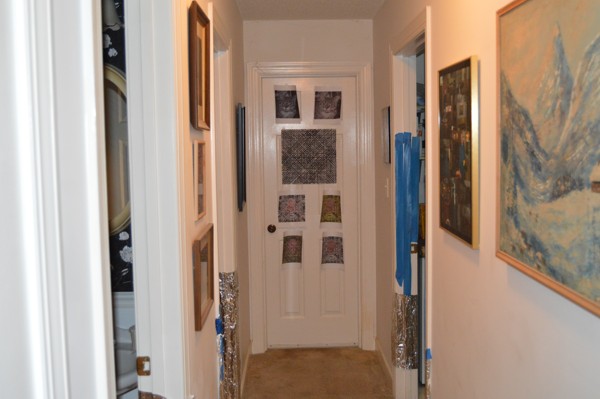
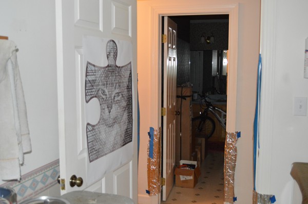
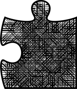
Linear lettering conforming to a puzzle piece shape.
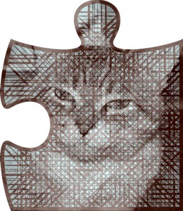
Linear lettering conforming to a puzzle piece shape incorporating an image.
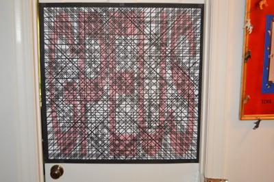 A full size, two foot by two foot test piece that incorporates a code on top of a code. One is read vertically, the other horizontally. I photograph each test piece and print it out on a standard sheet of paper to make sure it can be read.
The first Trithemian Web™ Cryptogram will not use the more sophisticated techniques I’ve developed over the years. It will incorporate a stereogram.